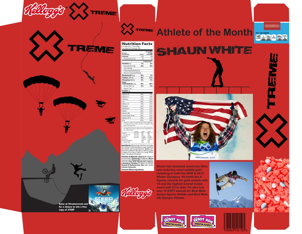
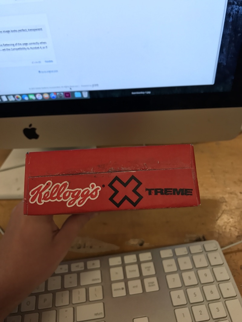
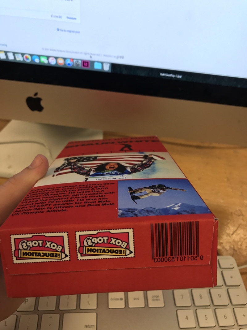
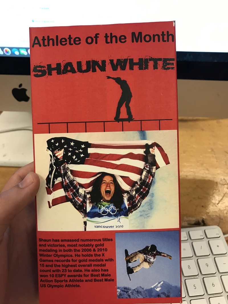
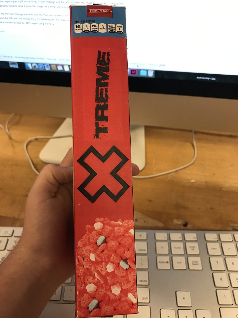
For this project we had to design a cereal box. I came up with the idea while watching X-games highlights. The red and black color scheme that I chose for this was inspired by the X-games logo. The rest of the logo is supposed to look like it was spray painted. The font that I used was called TABU. The design of the front was a bunch of extreme sports. I also added competition to win a video game like they sometimes have on cereal boxes. On the back of the box I had an athlete of the month. This was inspired by how Wheaties box's having different athletes on the cover. To make sure that it looked like a cereal box I made sure to add the nutrition facts were in the middle and a smaller one on the side. I also added box tops and a serial code on the bottom and the Kellogg's logo. I was also able to find a picture of red and white cereal that I thought fit in with the design well. The biggest issue that I had on creating the cereal box was printing it. There was a red box around all of my images which was especially noticeable on the skateboarder and biker on the half pipe.
Top
|

Front
|
Bottom
|
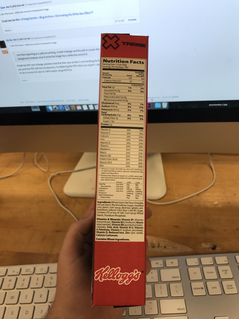
Right
|
Back
|
Left
|
