My Logos
For our first project this year we did parodies of companies logos. We had to insert our name or our initials into the logos. We had to make 10 total logos, 5 in Photoshop and 5 in Illustrator. Then we printed them out and had people make comments on them. After that we went back and fixed what people suggested we fix. I think that all of my logs were good. My favorites were my Starbucks logo, Harley-Davidson logo, NFL logo, McDonald's logo, and RadioShack logo.
Click a logo to be taken to its page
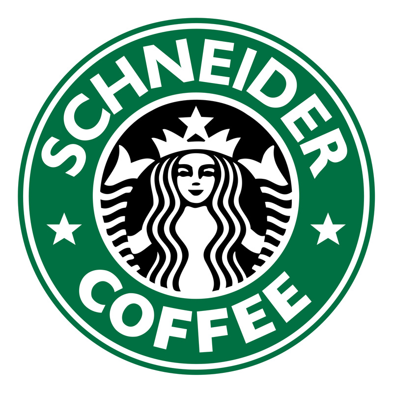
Starbucks Coffee LogoFor the Starbucks logo I started out by finding a .svg of the logo. Then I began to cover up the word Starbucks with rectangles the same color green as the logo. Next I took the Pen tool and drew an arch underlining the words Starbucks. I used this line to write my name on. The font that Gibson-Bold. This was one of the closest fonts that I could find to the real Starbucks font. I think that this project came out pretty well. If I could fix one thing in this project I would add a stroke to the font to make it thinker like the word Starbucks is in the original.
|
Harley-Davidson Logo
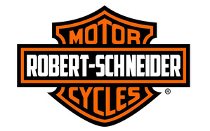
For this logo I took a picture of the Harley-Davidson Motor Cycles logo. The first thing that I did was cover the words Harley-Davidson. Next I went and looked for a font similar to the one used on the original. The font I used was American Captain. ROBERT-SCHNEIDER was longer than HARLEY-DAVIDSON so I had to extend the box. I did that by making a black square for the remaining length I needed and then measuring how much hung over after the orange. Then I redid the orange line around the box. I think that this Logo turned out very good. The one problem I have is that the font I used was a little thicker than the original.
RadioShack Logo
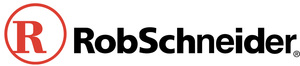
The RadioShack logo was the first logo that I did. I chose this logo because it had the capital R and S like my name does. The first thing that I did was to copy the letters that I could use for my name that were originally in the logo. I was able to use the R, o, d, S, c, h, and i. I then deleted the letters I could not use. For the rest of the Letters I needed I used the Helvetica font. I then Positioned the letters the way I needed them. RobSchneider ended up being longer then the original logo so I had to shrink down the R Radioshack logo. My one problem with this logo is that you can tell which letters were from the original logo and which were typed.
|
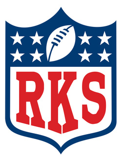
NFL LogoFor this logo I started out by covering the letters NFL with a white box. Then I went to find a font that looked like the NFL font. The font that I chose was called "NFL." Then I made the letters the same size as they are in the logo. I used a 685 point font. Then I smushed the layers down so that they fit into the logo and more resembled the NFL logo. Next I created outlines so that I could use the pen tool and direct select tool to get the letters to slant at the bottom. That was probably the most difficult part of any of the logos. Then I fixed the serifs on both the top and bottom to make them the same thickness as the original logo. I think that this logo turned out really well but I could of made the letters a little thicker.
|
